
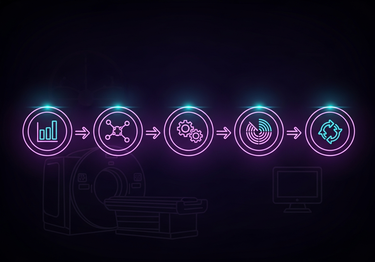
Radiology departments rarely lack ambition when it comes to improving throughput. What most lack is a repeatable method for turning that ambition into consistent gains. A faster workflow in radiology is not usually the product of one clever fix applied to one stubborn problem. It is the product of a disciplined sequence: measure before changing anything, map the full patient and study journey, redesign the steps actually slowing things down, watch the results in real time, and keep refining after go-live.
This article lays out that sequence as a five-step throughput framework, giving IT and radiology leadership a repeatable process they can apply to any department, at any volume, and revisit whenever conditions change.
Why Workflow in Radiology Needs a Process, Not a Punch List
Most radiology workflow optimization efforts start the same way: someone notices a pain point, such as slow report turnaround or a clogged worklist, and a fix gets applied. That approach solves the symptom in front of you, but it rarely holds up as volume grows, staffing shifts, or new modalities come online. Without a baseline to measure against, there is no way to know whether the fix actually worked.
A framework approach treats throughput as a system with measurable inputs and outputs, not a collection of isolated complaints. Each step below builds on the one before it, so skipping ahead to redesign before you have measured and mapped the current state tends to produce changes that address the wrong problem.
Step 1: Measure Baseline Throughput Metrics
Before changing anything, establish what “normal” looks like today. That means breaking the total imaging cycle into discrete time segments rather than tracking a single end-to-end number.
The segments worth tracking separately include ordered-to-scheduled (how long an exam waits for a scheduled slot), scheduled-to-scanned (the gap between the scheduled time and when the patient is actually on the table), patient-in-to-report-out (the full time a study spends inside the department), and exam-to-report (the interval from image acquisition to a signed report reaching the referring clinician). Each segment isolates a different part of the system, so a slowdown in one does not get masked by strong performance elsewhere.
Concrete thresholds help translate raw numbers into action. Many departments set an internal target of a preliminary report on STAT or emergency imaging within 45 to 60 minutes of image acquisition, and 24 to 48 hours for routine outpatient exams. An ordered-to-scheduled gap beyond 24 hours on routine studies is a common early warning sign that scheduling capacity, not radiologist bandwidth, is the constraint. These are starting points to calibrate against your own case mix and staffing model, not universal standards.
Where the Baseline Data Comes From
Pulling these numbers manually from separate RIS, PACS, and EHR logs is where most measurement efforts stall before they start. OmniPACS automatically captures timestamped events at every stage of the imaging cycle, so the baseline data needed for this step already exists, eliminating the need for a separate audit project. For a broader look at where turnaround time is typically lost, see the techniques for reducing report turnaround time, which cover the individual mechanisms that this framework later addresses in Step 3.
Step 2: Map the Value Stream
With baseline numbers in hand, the next step is to trace the path a study takes from order to distributed report, marking every handoff and every point where it sits waiting for the next action.
A typical value stream includes the order entering the RIS, the scheduling decision, patient check-in, technologist prep, image acquisition, transfer of images to PACS, retrieval of prior studies for comparison, the radiologist’s read, report signing, and final distribution to the referring physician. Each arrow between these boxes represents a handoff, and each handoff is a place where a study can sit idle waiting for a system, a person, or a queue to catch up.
Wait states are usually invisible in aggregate turnaround numbers because they get averaged out. Mapping makes them visible individually: a study might spend 12 minutes on acquisition and 40 minutes waiting for a prior to load, but a blended metric would never show that split. This is also where integration gaps tend to surface. Departments running separate RIS, PACS, and EHR platforms often find a meaningful share of their wait states trace back to integration challenges between EHR and PACS rather than any single department’s internal process.
Validate the Map With Your Team
Walk the map with the people who do the work, not just the metrics. Technologists, schedulers, and radiologists will spot wait states that never show up in a system log because they are working around them manually.
Step 3: Redesign the Bottleneck Steps
Once the map shows where time is actually lost, redesign follows a straightforward rule: automate the currently manual handoffs and remove decisions that do not require a human in the loop in every case.
Five redesign moves consistently produce the largest gains. Prefetching prior studies automatically when a new exam is scheduled, rather than waiting for the radiologist to request them, eliminates the wait state identified in Step 2. Worklist auto-routing based on exam type, modality, and clinical urgency replaces manual queue sorting and static STAT labels that lose meaning when overused. Structured reporting templates tied to study type reduce time spent composing findings from a blank page. Voice recognition macros trained on radiology-specific vocabulary cut transcription correction time inside the reporting interface. Hanging protocols configured for every modality-body-part combination eliminate manual display adjustments that eat into reading time on nearly every study.
OmniPACS supports each of these directly: configurable worklist routing rules, structured reporting with voice recognition built into the same viewer, and hanging protocol libraries that persist across reading stations regardless of which radiologist is signed in. For departments still coordinating routing logic across a separate RIS and PACS, adopting a unified RIS-PACS integration removes the translation layer that slows automated routing down, and with modern PACS workflow tools, most of these five moves are often covered in a single platform rather than stitched-together point solutions. If your department is still running these processes manually, OmniPACS delivers scalable monthly plans that make this level of automation practical for community imaging centers, not just large enterprise budgets.
Step 4: Instrument and Monitor
Redesigning bottleneck steps only produces a lasting gain if someone can see, in near real time, whether the change is holding. This step puts dashboards, alerts, and drill-down analytics in place so that throughput becomes visible on an ongoing basis rather than only when a complaint reaches leadership.
A well-designed throughput dashboard shows current queue depth, estimated turnaround time by modality, and a delay status for studies at risk of missing target. One documented approach from an emergency department radiology dashboard calculated expected turnaround time as a rolling average of the five most recent studies of the same modality, then flagged studies as on track, average, or severely delayed based on how far the current estimate diverged from that baseline. In that deployment, fewer than 1 percent of studies missed the estimated turnaround by more than two hours once the dashboard was in active use00939-6/fulltext), giving radiology and referring departments a shared, real-time picture instead of relying on phone calls to check status.
Alerts matter as much as the dashboard itself. A queue depth alert that fires before a backlog becomes visible to referring physicians gives a director time to reallocate reading assignments proactively. Drill-down analytics that let a manager click from a departmental average into the individual studies driving it turn a single number into an actionable list. OmniPACS includes built-in analytics dashboards with configurable alert thresholds, so the metrics defined in Step 1 stay visible to the people who can act on them instead of living in a report generated once a month and then archived.
Step 5: Build the Continuous Improvement Cycle
A framework that stops after the redesign and monitoring steps will drift back toward its old baseline as case mix, staffing, and technology change. The final step closes the loop with a recurring review cadence.
A weekly review of the dashboard metrics from Step 4, involving both radiology and IT leadership, keeps small regressions from becoming entrenched problems. When a metric moves the wrong way, pilot a single change on a limited scope, such as one modality or one reading pod, before rolling it out department-wide. This keeps the blast radius of an unsuccessful change small.
Retraining is part of this cycle, not a one-time event tied to go-live. New hires, protocol updates, and software changes reset institutional knowledge for at least part of the team, and skipping refresher training is a common reason a well-designed workflow degrades within a year. Radiology has room to grow in benchmarking maturity compared with other clinical specialties. Presenting at RSNA 2024, one quality improvement speaker pointed to disciplines such as mammography and surgery, which operate under standing data collection and benchmarking programs that radiology departments could adapt for their own throughput reviews. Treating the framework as a recurring cycle, not a one-time project, is what makes those comparisons realistic.
Turning the Framework Into a Habit
None of these five steps require a wholesale platform replacement to begin. A department can start by instrumenting the baseline metrics in Step 1 using tools already in place, then move on to mapping and redesign as bandwidth allows. What matters most is treating this as a repeatable cycle, not a single project with a defined end date.
The departments that sustain their throughput gains build measurement, monitoring, and review into the department’s operating rhythm, not just into the initial implementation plan. OmniPACS was built around that same principle: the analytics, routing, and reporting tools needed for each step of this framework live inside a single cloud-native platform rather than a patchwork of add-ons. If your department is ready to put a structured throughput framework in place, explore OmniPACS solutions to see how the platform supports every stage of the process described here.
Frequently Asked Questions
What is the first step in optimizing workflow in radiology?
Measure baseline throughput metrics before making any changes. Without segment-level data on how time is actually spent, from order entry through report distribution, it is impossible to know whether a later redesign improved anything or whether the results were coincidental.
How long should report turnaround time be for a radiology department?
Targets vary by exam type and urgency, but many departments use 45 to 60 minutes for STAT or emergency imaging and 24 to 48 hours for routine outpatient studies as internal benchmarks, calibrated against their own case mix rather than treated as fixed standards.
What is value stream mapping in a radiology workflow?
It is the practice of tracing every step a study takes from order to final report, identifying each handoff between systems or people, and marking where studies sit waiting rather than actively moving. This makes wait states visible individually rather than hidden in an averaged turnaround number.
How often should a radiology department review throughput metrics?
Weekly reviews involving both radiology and IT leadership are common for catching regressions early. Monthly or quarterly deep-dive reviews work well for evaluating larger structural changes, such as new hanging protocol libraries or worklist routing logic.
How does OmniPACS support a 5-step throughput framework?
OmniPACS captures timestamped throughput data automatically, provides configurable worklist routing and hanging protocol libraries for redesign, and includes analytics dashboards with alert thresholds for ongoing monitoring, covering the tooling needed for each step in this framework in a single platform.